Top 5 print design mistakes and how to avoid them
Print marketing remains a powerful tool for businesses looking to make a lasting impression. However, even the best designs can fall flat if common print design mistakes are overlooked. Here are five of the most common print design errors and how to avoid them to ensure your marketing materials look professional and polished.
1. Using low-resolution images
One of the most frequent mistakes in print design is using low-resolution images. Digital images that look sharp on a screen may appear pixelated or blurry when printed.
How to avoid it:
- Ensure all images are at least 300 DPI (dots per inch) for high-quality print.
- Use vector graphics where possible, especially for logos and icons.
- Always check the printer’s specifications before finalising your design.
2. Ignoring bleed and safe margins
A design that extends to the edge of a printed piece requires a bleed area to prevent unwanted white borders. Similarly, placing important elements too close to the edge may lead to trimming issues.
How to avoid it:
- Extend the background or images at least 3mm beyond the trim line to create a proper bleed.
- Keep important text and elements at least 5mm inside the trim line to avoid accidental cropping.
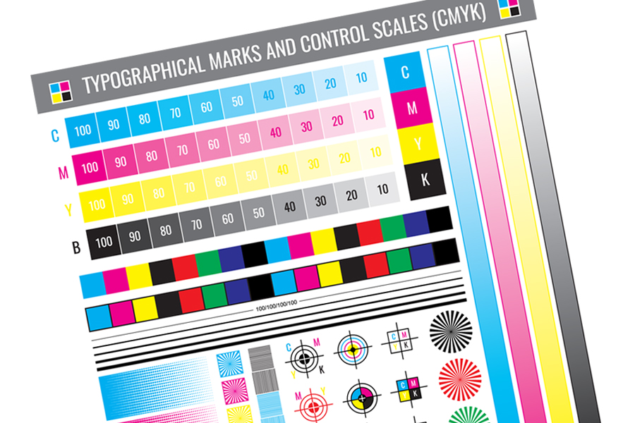
3. Incorrect colour mode
Designing in the wrong colour mode can cause unexpected shifts in colour when printed. Screens display colours in RGB (Red, Green, Blue), but printers use CMYK (Cyan, Magenta, Yellow, Black).
How to avoid it:
- Always set your document to CMYK mode before starting the design.
- If you need precise colour matching, use Pantone colours or request a proof from the printer.
- Avoid overly vibrant colours that may not print as expected.
4. Overloading the design with fonts and effects
Too many fonts and excessive special effects can make a design look cluttered and unprofessional.
How to avoid it:
- Stick to two or three fonts for consistency.
- Use bold, italics and other effects sparingly to maintain readability.
- Ensure the font size is appropriate, particularly for smaller printed materials like business cards.
5. Neglecting proofreading and print previews
Spelling mistakes, alignment issues and formatting errors can ruin an otherwise perfect design.
How to avoid it:
- Proofread all text thoroughly before sending it to print.
- Print a test version at full size to check for any formatting issues.
- Ask for a printed proof from your printer to catch any last-minute mistakes before mass production.
In conclusion…
Avoiding these common mistakes can help you create print materials that are not only visually appealing but also professionally executed. By paying attention to image resolution, bleed settings, colour modes, typography and proofreading you can ensure that your print designs leave a strong and positive impression.
Of course, you don’t need to worry about any of this if you let Mondo Marketing handle your project! We’ll make sure your prints look flawless – designing well and proofreading thoroughly, leaving you to sit back and relax. Get in touch and let’s create something amazing together.